New York or Nowhere

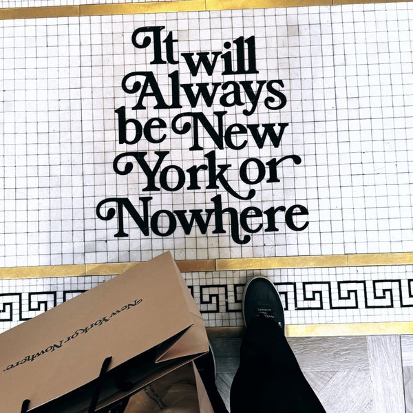
New York or Nowhere captures the essence of what it means to live and breathe the dynamic culture of New York City. As a graphic designer, I’m fascinated by how this brand uses typography to tell a story. Their bold, minimalist designs resonate with the urban hustle and energy that New York is known for.

More than a fashion label, New York or Nowhere is a cultural movement. Their designs are inspired by the city's architecture, graffiti, and vibrant energy. Every piece they create tells a story of resilience, creativity, and identity.

New York or Nowhere storefront
New York or Nowhere collaboration

Their collaborations with brands like the New York Yankees elevate their design ethos. These partnerships combine bold typography, clean lines, and cultural relevance. It’s a perfect blend of streetwear and graphic design, making their work not only fashionable but also thought-provoking for the creative industry.

The New York Yankees collaboration, for instance, reimagines sportswear by infusing the brand’s unique identity into iconic designs. For graphic designers, this demonstrates how visual identity can transform even the most familiar symbols into something fresh and meaningful.

The reason New York or Nowhere resonates with me personally is its emphasis on identity and community. They’ve managed to create a design language that’s not only aesthetically pleasing but also deeply emotional. The typography feels powerful yet approachable, a testament to the skillful way they use design to communicate ideas.

For graphic designers, the brand serves as a reminder of the importance of storytelling through typography. The balance of bold and minimal design elements creates an emotional connection that every designer aspires to achieve in their work.

New York or Nowhere product