

The Met Gala has long been a beacon of artistic expression, blending fashion, culture, and typography in ways that inspire millions. The event is not just about extravagant gowns and daring ensembles; it is a celebration of visual storytelling. One of the most compelling elements of the Met Gala is its use of typography in branding, invitations, and promotional materials. The fonts selected each year reflect the theme, setting the stage for an unforgettable night.
Typography at the Met Gala is not just decorative; it holds meaning and power. The bold serif fonts used in branding evoke a sense of grandeur, mirroring the lavish nature of the event. At the same time, modern sans-serif fonts bring a contemporary edge, illustrating how tradition and innovation blend seamlessly. The typography choices contribute to the overall aesthetic, ensuring that every detail aligns with the event’s opulence.
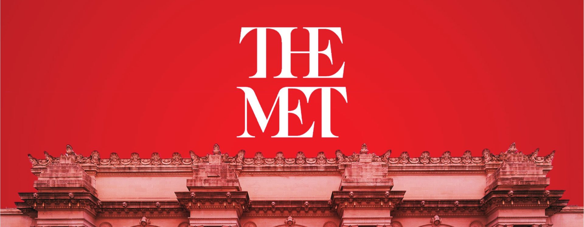
One of the most iconic examples of Met Gala typography is its signature logo transformations over the years. The balance of serif and sans-serif elements, the deliberate spacing, and the luxurious gold or monochrome themes all reinforce the idea of high fashion and sophistication. The way the text is arranged on invitations and advertisements influences the audience's perception, making them feel part of something truly grand.
Typography extends beyond just print and digital materials—it is present in the very fabric of the event, from the step-and-repeat banners to the runway itself. Every word, every letterform is carefully curated to complement the overarching theme. It’s this meticulous attention to detail that makes the Met Gala not just an event, but an experience that resonates with artists, designers, and spectators worldwide.