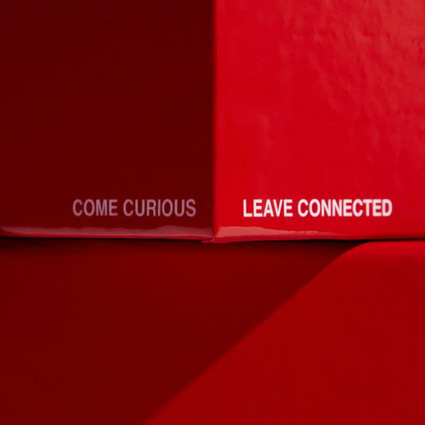
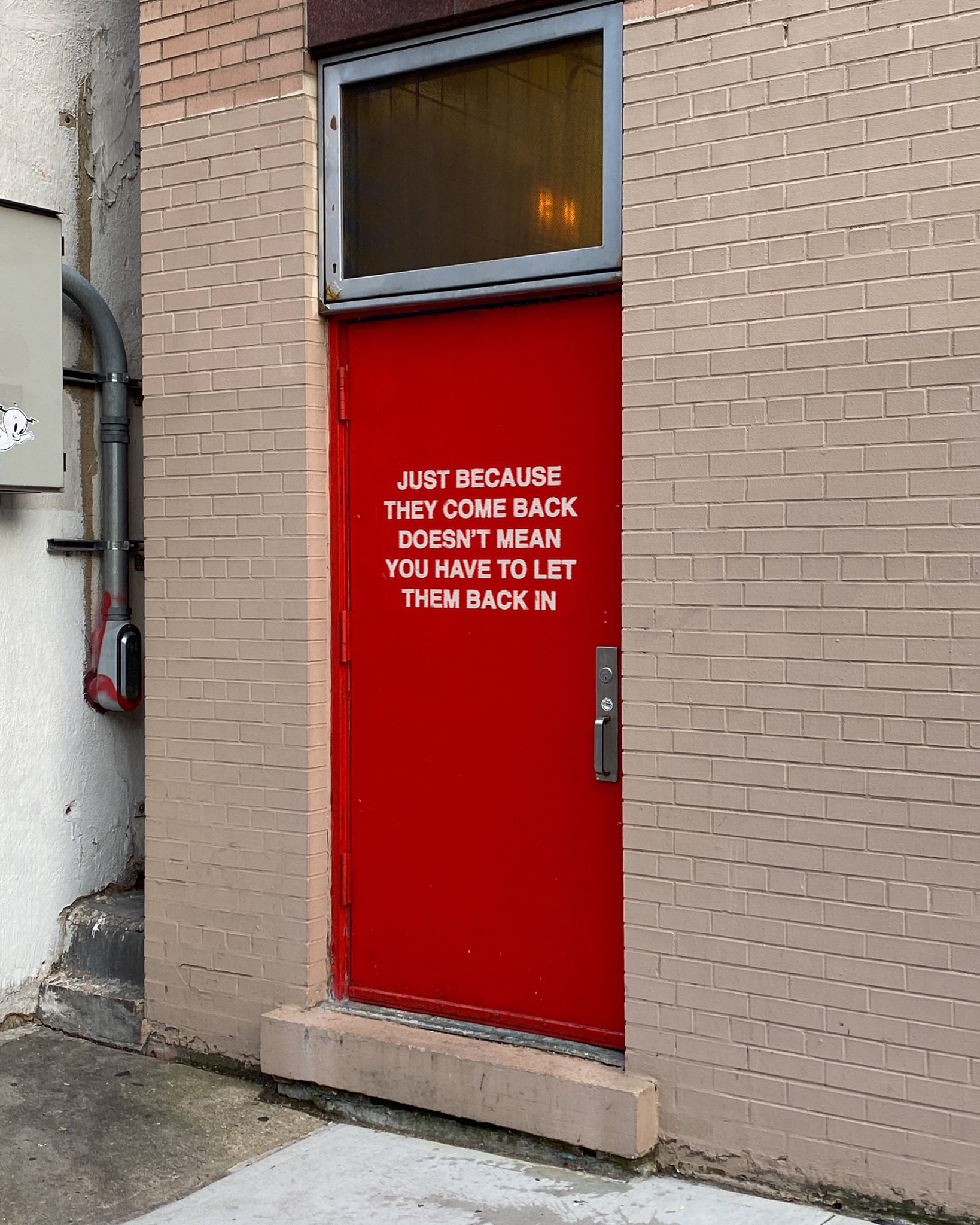
We're Not Really Strangers (WNRS) is more than just a game—it's an emotional tool designed to deepen connections. With its simple yet powerful questions, it encourages vulnerability and real conversations. The typography is minimal yet bold, mirroring the direct and impactful nature of the game itself.
The game’s red and white branding evokes passion and intensity, reinforcing its goal of fostering emotional depth. The typeface choices, often bold sans-serifs, convey clarity and honesty. Seeing *WNRS* in public spaces or social media always inspires me—it's a testament to how typography can drive a movement.
What fascinates me most about WNRS is how its design reflects its purpose. The strong contrast, the clean typography, and the simplicity of the layout allow the words to take center stage. It proves that in design, sometimes less is more, and a well-executed typographic choice can be just as impactful as the message itself.