
NYC subway typography reflects the city’s grit and energy, using Helvetica for clarity and uniformity.
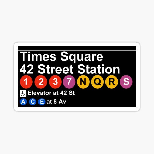
Inspired by Vignelli’s 1970s signage, the typeface blends modernism with urban chaos.

The MetroCard’s bold typography is instantly recognizable, mirroring NYC’s fast-paced aesthetic.